English
  Turkish
  Deutsch

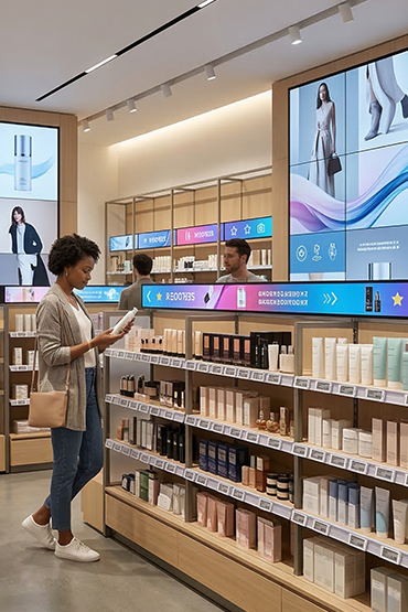
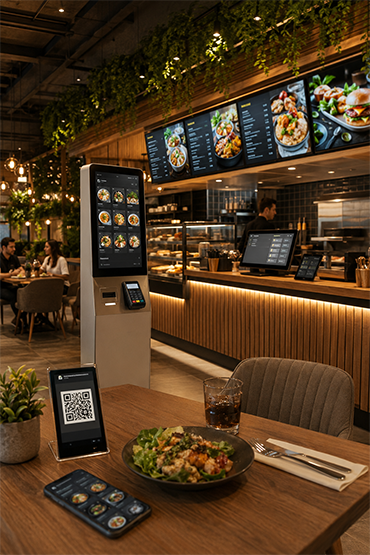
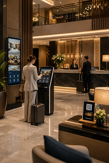
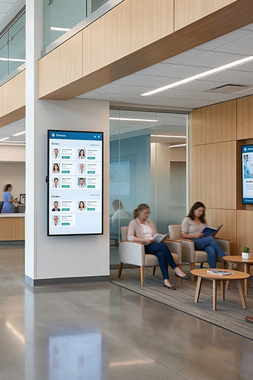
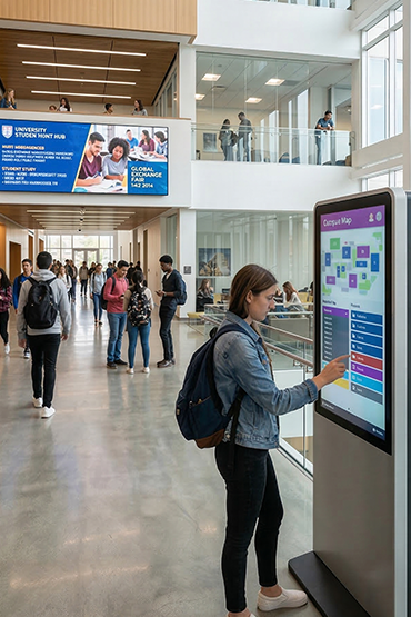















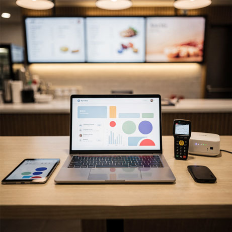
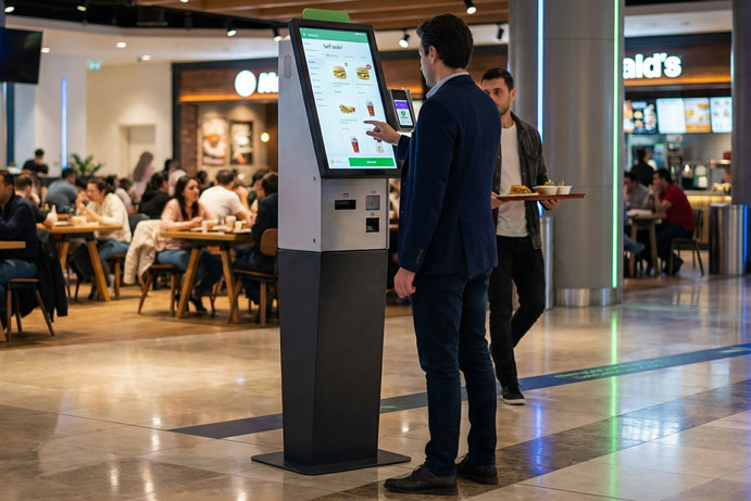

An attractive screen design still needs a clear message. Someone passing a storefront has a different viewing time from a guest waiting in a hotel lobby. Start digital signage content planning with the communication goal and viewing conditions. Then decide how to publish the content.
This guide does not prescribe one universal duration or font size. Its purpose is to make content testable at the actual location. A useful screen message depends on planning the idea, format and update process together.
Give every item one primary message
Before designing, state what the audience should learn or do. Noticing a new product, reading a price and finding a department are different objectives. Establish a priority rather than placing the entire product catalogue on a single promotional screen.
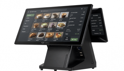
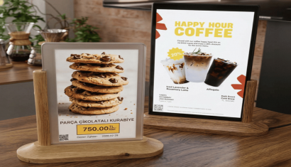
For a hypothetical coffee offer, the product, price and valid period might lead the layout. Move longer explanations to another item or an appropriate digital channel. Check that the image and headline reinforce the same message instead of competing for attention.
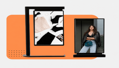
Design separately for landscape and portrait
A 1920×1080-pixel canvas with a 16:9 ratio is not the same layout as a 1080×1920-pixel canvas with a 9:16 ratio. These are examples; the correct working size depends on the actual screen resolution and publishing arrangement. Do not squeeze a landscape design into portrait orientation.
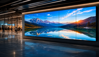
For a video wall or divided layout, obtain the dimensions of each content region. Preview prices, logos and contact information near the edges. A file opening correctly on a design computer does not establish identical behaviour on the deployed player, so test the actual device.
Make readability a design requirement
Create sufficient separation between text and background. W3C's web accessibility guidance explains the importance of text contrast. Use that principle as a design aid, not as evidence that an entire signage installation has been certified accessible.
Do not communicate meaning through colour alone. Add wording or an icon to states such as available or promotion ended. Providing another visual cue alongside colour is also an approach described by W3C.
Test duration against the information load
Rather than enforcing an identical number of seconds everywhere, consider where viewers are standing and how they encounter the screen. Try a short product message in a passing area and a more explanatory sequence in a waiting space. Assess whether the audience can finish reading before the next item appears.
Do not hide the main message at the end of an animation. Important information should remain understandable when sound is off or a sequence is encountered halfway through. Where audio is proposed, review suitability for the setting and avoid making essential information audio-only.
Deliver a publishing plan with the files
Name files using campaign, language, orientation and version. Record start date, end date, destination and approval owner with the content. Decide what replaces a promotion before it expires rather than leaving the last frame indefinitely.
For multilingual material, do not expect translated text to occupy the same space. Review English and German layouts individually. Prices, dates, units and product names deserve a separate content check, even when the visual template remains unchanged.
Separate template work from ongoing production
Create reusable structures for menus, announcements and offers. Define fixed elements and editable areas, then choose a layout that remains stable when a product image or price changes. Test the template on the intended screens before giving it to other editors.
When content production is outsourced, specify the number of new designs, revisions, language adaptations and publishing checks. DSFeed's service description includes content preparation and publishing planning, but the deliverables for a particular project should still be agreed explicitly.
Check the live result and evaluate fairly
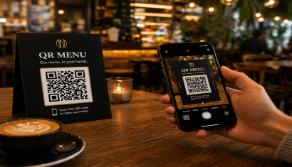
Before publication, review product, price, date, language, image and destination. If a QR code is used, scan it on the actual screen from the intended position. After changing a file, inspect the displayed result rather than relying only on a successful upload message.
When assessing performance, avoid changing the design and several campaign conditions at once. Record which version ran and when. Do not automatically attribute changes in sales or interactions to one visual; define a comparison that makes the result interpretable.
Build a repeatable content workflow
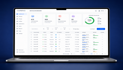
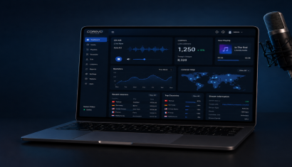
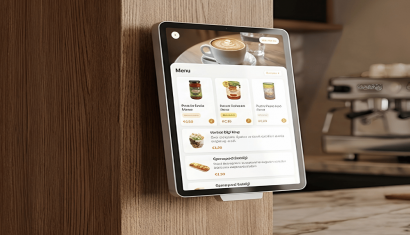
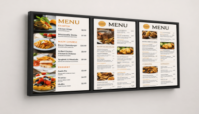
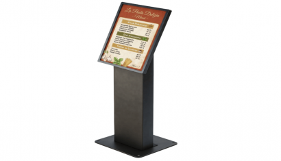
A content schedule, named owner and review process help a screen network remain current. Review Digital Signage Services for production and operational scope and Corevo for publishing management. For restaurant content, include Menu Board Displays in the design brief so the creative work reflects the actual screen arrangement.
Frequently Asked Questions
Should all signage graphics use the same dimensions?
No. Base the file on orientation, target resolution and the size of its assigned content area. Check portrait, landscape and divided layouts separately.
How long should each slide stay on screen?
There is no universal duration for every setting. Use a readability test with the actual content and viewing conditions to determine timing.
Does every item need to be a video?
No. Select static or moving content according to the message. Use animation where it serves a clear purpose rather than simply adding motion.
Can a QR code be displayed on a screen?
Assess it through tests of destination, scan distance, visible duration and actual screen size. Explain the destination beside the code.
What should a content service quotation specify?
Separate new designs, revisions, translation, source files, schedules and review responsibilities. Define measurable deliverables for recurring services.